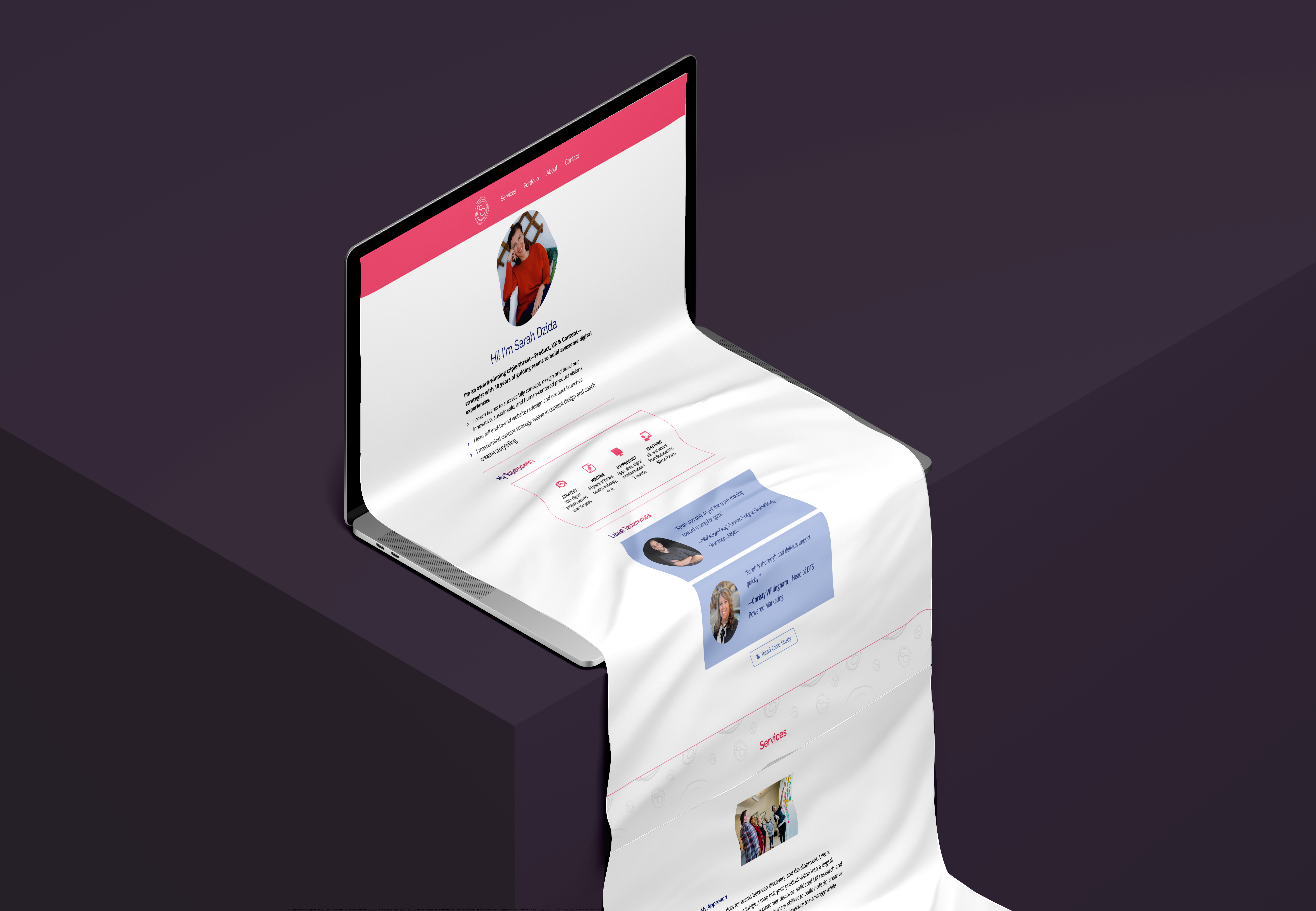
Sarah
Dzida's
website
Transforming an Expert's Online Presence
I interned at Sarah Dzida Consulting, where I had an amazing experience working on various projects throughout the spring and spent 12 weeks on this keystone project.
My role encompassed strategic planning, research, design, problem-solving, collaboration, and effective communication.
Throughout the process, I collaborated closely with Sarah, seeking her feedback and incorporating her vision for the website. It involved multiple iterations, discussions, and fine-tuning to align the design with her specific needs and aspirations.
UX and Content strategist
12 Weeks
Figma
Individual

Context
Overview
As the intern working with Sarah Dzida, a product, UX, and content strategy consultant, was exhilarating.
However, it was evident that her website needed a makeover. Despite her expertise in user experiences, her site had grown dull and unfriendly due to her busy schedule and lack of updates. This irony became the catalyst for my project, with Sarah becoming my client.
Challenge
Transforming Sarah's Professionalism into Approachable Excellence
Our goal was clear: showcase Sarah's unique personality and professional expertise while maintaining a friendly and approachable tone. We aimed to boost website visibility and enhance user experience, aligning with her brand as a leading consultant.
Roadmap
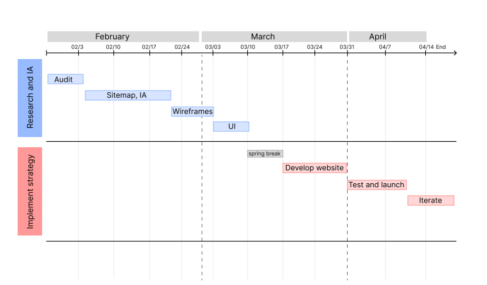
Before diving into the website redesign, I recognized the importance of careful planning. Explore the comprehensive roadmap that guided our project, ensuring a smooth execution and keeping us focused and organized. This roadmap was more than just a plan; it was our communication lifeline, offering clarity and transparency at every project stage.

Design
Process
The design process unfolds through the following stages:
- Discover
- Define
- Develop
- Deliver
Discover
Audit
Gain insights into how I meticulously audited Sarah Dzida's existing website content. Discover the strengths and weaknesses, and learn how I identified areas for improvement, assessed alignment with Sarah's brand, and addressed outdated or redundant content.
Discover
Competitor
Research
I analyzed competitors' websites to uncover trends, design patterns, and best practices. Understand how this research-driven approach informed not only design decisions but also user-centric content creation.
This research-driven approach not only informed the design decisions but also contributed to crafting compelling and user-centric content for the website.

Empahtize
User
Research
Stakeholder interview
Interviewing Sarah, the key stakeholders, deepened my understanding of the project's context and objectives. Sarah's vision, target audience, and desired services shaped my strategy.
By incorporating the insights gathered from the interview, along with the findings from the content audit and competitor analysis, I created a comprehensive and well-informed strategy for the website redesign.
Define
Strategy
Plan
Starting to generate ideas and create concepts
Based on insights from the interview, we defined a friendly yet professional branding tone, aligning with Sarah's personality. This tone set the stage for a static website, ensuring a cohesive message and design. Removing the "Consulting 1:1" page allowed for efficient schedule management while highlighting her consulting services on the homepage.
The CMS Dilemma
As hiring a developer for the website development was not within the scope of the project, I explored alternative solutions to ensure an efficient and cost-effective approach. After careful consideration, I proposed different CMS options to Sarah, presenting a thorough comparison of their prices and benefits. I emphasized the long-term investment value each CMS offered, particularly in terms of future content expansion and ease of management.
Develop
Sitemap
and IA
2 options
As Sarah remained undecided about the best CMS fit, I took the initiative to address the development constraints and cater to her needs.
I presented two sitemap options, each reflecting Sarah's professional persona. These structures streamlined content organization, ensuring easy navigation and access.
By providing these two sitemap proposals, I aimed to offer flexibility and options that aligned with her preferences and project constraints.

Deliver
Wireframes
The Decision
To illustrate potential layout variations, I created both low-fidelity (lo-fi) and high-fidelity (hi-fi) wireframe options.
At the end, Sarah opted for a one-page website and retained her CMS

Deliver
KPIs
Since Sarah opted for a one-page website, she posed the challenge for integrating additional functionalities like analytics or traffic visualization tools
Takeaways
Things I would have done if I had more time
While redesigning the website, we seized an opportunity to create a landing page for Sarah's mentorship program. This highlighted the flexibility of a one-page website. We identified areas for further improvement, including localization features, marketing tools, and comprehensive documentation.
Reflection
Despite the challenges, the journey was rewarding as it provided me with a glimpse into the professional world of consulting and UX design. Sarah's trusted in my abilities encouraged me to push my boundaries, and the successful completion of the project left me with a sense of accomplishment and readiness to tackle future consulting endeavors with even more confidence.
Throughout the website redesign project, I gained valuable takeaways through comprehensive research and collaboration. Being flexible and adapting to a one-page format, considering budget constraints, and paying close attention to content and branding resulted in a polished online presence. Real-world client experience provided insights into managing expectations and incorporating feedback.